效果预览
先看图:
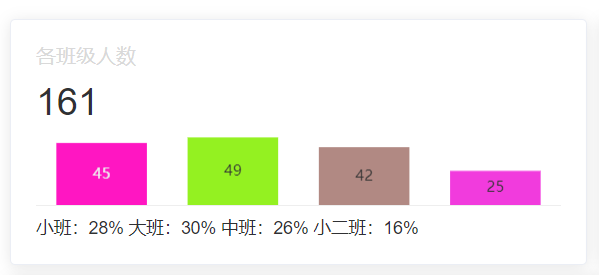
从图中可知,该卡片(组件)分为四个部分:头部标题, 文字描述, 主要内容部分(图表), 底部文字
组件封装
该组件基于element-ui的card组件进行封装
首先,我们需要将这个卡片封装成一个组件,方便我们在其他地方使用,这里我们将其命名为Detail.vue
页面结构如下:
<template>
  <div>
    <!--标题-->
    <div class="card-header">
      <span>{{ title }}</span>
    </div>
    <!--内容(数字,文字)-->
    <div v-if="count" class="card-content">{{ count }}</div>
    <!--图表-->
    <div>
      <slot name="carts"></slot>
    </div>
    <!--底部-->
    <div class="card-footer">
      <slot name="footer"></slot>
    </div>
  </div>
</template>
js部分:
<script>
export default {
  name: 'Index',
  props: {
    title: {
      type: String,
      default: '默认标题'
    },
    count: {
      type: String,
      default: ''
    }
  }
}
</script>
css部分:
<style scoped>
.card-header {
  display: flex;
  justify-content: space-between;
  color: #d9d9d9;
}

.card-content {
  font-size: 30px;
  padding: 10px 0;
}

.card-footer {
  border-top: 1px solid #eee;
  padding-top: 10px;
  font-size: 14px;
}
</style>
使用组件
新建一个card文件夹,将Detail.vue放入其中,然后在index.vue中引入:
文件夹结构如下:

在图中多出的几个文件夹是echarts的图表组件,后面会用到
为了便于页面的布局,这里使用el-row和el-col进行布局,代码如下:
 <el-row :gutter="10">
   <!--1各班学生人数-->
   <el-col :span="8">
     <el-card class="box-card">
       <Detail title="各班级人数" :count="total">
         <template slot="carts">
           <barCharts/>
         </template>
         <template slot="footer">
           <span>{{ classPercent }}</span>
         </template>
       </Detail>
     </el-card>
   </el-col>
</el-row>
el-col的span属性表示占据的列数,这里我们将其分为三列,每列占据8列,即一行显示三个卡片,后续会展示效果
由上述代码可知,我们将Detail组件封装成了一个卡片,然后将barCharts组件放入了Detail组件中
为方便叙述,这里省略barCharts组件的代码,只展示效果
假如在上述代码中,total的值为161,classPercent的值为小班:28% 大班:30% 中班:26% 小二班:16%
那么效果如下:
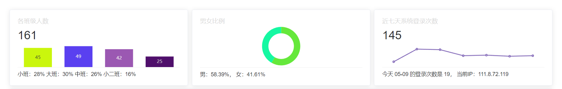
完整效果演示
由于前面设置了每行显示三个卡片,现在先预览一下效果:
完整代码如下:
<el-row :gutter="10">
   <!--1各班学生人数-->
   <el-col :span="8">
     <el-card class="box-card">
       <Detail title="各班级人数" :count="total">
         <template slot="carts">
           <barCharts/>
         </template>
         <template slot="footer">
           <span>{{ classPercent }}</span>
         </template>
       </Detail>
     </el-card>
   </el-col>
   <!--2男女比例-->
   <el-col :span="8">
     <el-card class="box-card">
       <Detail title="男女比例">
         <template slot="carts">
           <pieCharts :gender-ratio="genderRatio"/>
         </template>
         <template slot="footer">
           <span>{{ genderRatioString }}</span>
         </template>
       </Detail>
     </el-card>
   </el-col>
   <!--3系统登录次数-->
   <el-col :span="8">
     <el-card class="box-card login-info" @click.native="goLoginInfo">
       <Detail title="近七天系统登录次数" :count="sevenDaysLoginCount.toString()">
         <template slot="carts">
           <line-charts ref="lineCharts"/>
         </template>
         <template slot="footer">
           <span>今天 {{ today }} 的登录次数是 {{ todayLoginCount }}, 当前IP:{{ loginIp }}</span>
         </template>
       </Detail>
     </el-card>
   </el-col>
</el-row>
由于第二个卡片的图表问题,需要修改一下Detail中的css样式:
<template>
  <div>
    <!--标题-->
    <div class="card-header">
      <span>{{ title }}</span>
    </div>
    <!--内容(数字)-->
    <div v-if="count" class="card-content">{{ count }}</div>
    <!--图表 此处被修改了-->
    <div :style="{ height: count !== '' ? 55 + 'px' : 110 + 'px' }">
      <slot name="carts"></slot>
    </div>
    <!--底部-->
    <div class="card-footer">
      <slot name="footer"></slot>
    </div>
  </div>
</template>